
.png)
Colour. A powerful part of interior design.
Inside the home, colour can promote visual interest when it is used in the paint on the walls, the furniture and the decor. When you are flipping through a home magazine or scrolling through your favourite designer's social media, the way a space is portrayed in an image can affect how you feel. Whether you are admiring a serine bedroom or you find yourself dazzled by a vibrant living room, the method of the design evokes an emotion within us. Why does this happen? Scientists have proven through the study of colour psychology that colours have the power to affect how we feel and how we behave. This fact coincides with the colour of the paint in our homes. It can make a space feel energetic, serene, happy or even sad.
Warming up, or cooling down?
Colours can be broken into two distinctly different categories, warm colours and cool colours.
.png)
.png)
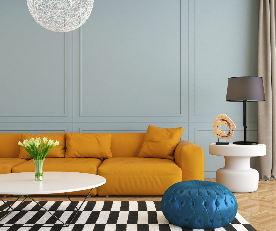
- Warm colours feel like sunshine! They instill the emotions of happiness, energy and vibrancy within us. These lively shades are in hues of red, pink, orange and yellow. The colours you can find while admiring a beautiful evening sunset.
- Cool colours feel peaceful. Their complicated and breathtaking hues play off the wonders of the earth. These subtle shades include blues, greens, and violets. They can feel soothing, calm and soft when we are around them. Just like watching the water stream down a tall waterfall into the lake below it, surrounded by trees.
.png)
- Now that we have identified some of the feelings these hues of warm and cool colours exude, it is time to give them a place within the design of our homes. When you are unsure which colour will fit in a space you are fixing up, simply ask yourself "What should the energy of this space be?" If you want a relaxed atmosphere, stick with cool colours, if you want a lively atmosphere steer towards warm colours.
- We all have personal tastes and preferences when it comes to how we decorate our own living spaces. The way you use colour is personal to you. A bold colour may make you feel electric and excited, but it may make someone else feel on edge or irritated. We all perceive colour differently. If you are considering changing up the paint adorning the walls in your home, it is vital to consider the feelings that the colour you are choosing evokes within you before you bring out your roller!
Breaking Down The Shades
The Living Room
- The living room is where loved ones gather.
- Within your space, do you want the room to feel exciting, to stimulate conversation and a boost of energy?
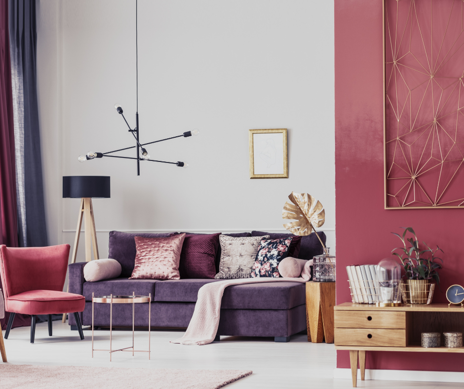
- If you are an avid entertainer, shades of red and magenta compliment a living room nicely. They are sophisticated and bold, just like a thriving dinner party.
- Or is this an area of quiet relaxation to take a moment to reset?
- If you prefer to curl up with a good book and some soft music in the background, head in the blue, and green direction to evoke a more tranquil and gentle atmosphere.
.png)
The Bedroom
- When you are winding down for the evening, ready to soon fall asleep, you want to feel relaxed and calm.
- Soft earth tones work best in this environment to enhance these peaceful feelings of rest.
- Shades of ocean blues, natural greens and soft pinks will help you to find serenity in the space.
.png)
The Home Office
- Within the home office, the design goal is to promote concentration and focus on the tasks at hand.
- Naturals are well known to work well in this space.
- Try playing with hues of white, beige or grey to see which compliments the room best depending on the amount of light in the space.
- If your workspace involves creativity, artistry or imagination we recommend painting the room in shades of pink or violet. These colours are known for their stimulation of the brain in this area.
.png)
The Dining Room
- The dining room can be a playful and colourful space to entertain and spend time with family enjoying a delicious meal.
- This is the room to take risks when it comes to colour! To stimulate lively conversation and increased hunger, we recommend shades of red and orange.
- Yellow and violet additionally are positive and uplifting colours that are also welcome in the space.
.png)
The Bathroom
- At the end of a long day, the bathroom is where we get ready for bed and enjoy a calm shower or bath to melt the stress of the day away.
- A few colours that work well in this space are shades of violet, sky blue and sage green.
- These colours promote a fresh feeling and calming energy to help you to relax and feel your best.
In conclusion...
.png)
We hope that these colour theory facts can help you to create a happy and uplifting environment within your home that will improve your everyday living. Sometimes the smallest changes can make all the difference to change our mood and our outlook on life. If any of these ideas have worked for you, let us know what changes you made by tagging us on Instagram!
Happy Painting!
Post a comment